Artists
Related: About this forum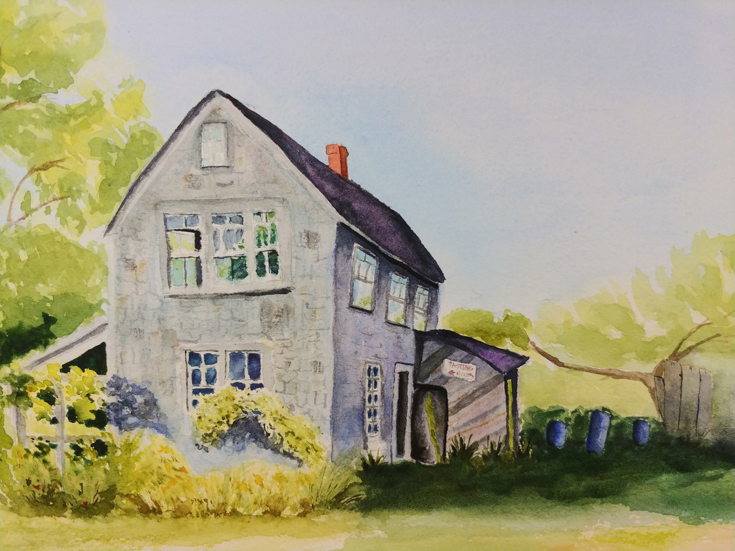

 = new reply since forum marked as read
Highlight:
NoneDon't highlight anything
5 newestHighlight 5 most recent replies
= new reply since forum marked as read
Highlight:
NoneDon't highlight anything
5 newestHighlight 5 most recent replies
Hoyt
(54,770 posts)
MLAA
(19,738 posts)Though it looks great as is.

MontanaMama
(24,717 posts)of a winery. 

GreenPartyVoter
(73,393 posts)
Sanity Claws
(22,408 posts)If you do, maybe something in the upper right corner? A dark cloud that casts a shadow and adds some ambiguity in mood? Maybe just a more intense blue in part of the sky?
wendyb-NC
(4,683 posts)
JDC
(11,101 posts)I use water colors and ink pen a lot and I sometimes overdo it. I have found that if I walk away from something or put it away for a month, then review it later, it is much better than I thought originally. Perceived "imperfections" at the time of creation are assets in 2 weeks.
I think this is really, really good. Frame and hang it.
Thanks for sharing.

Karadeniz
(24,745 posts)flying rabbit
(4,961 posts)vegetation closest to us, and make the sky less monochromatic.

bif
(26,967 posts)Maybe add a little more contrast in the sky. But otherwise, I wouldn't change a thing.

Star-Thrower
(309 posts)more shades of green? I would darken the sky a little bit, but this is your work not mine, and it is as it should be. So keep up the good work!